I worked a bit more on making the tree placement better. I’m rendering out a texture map that denotes where the lift lines and ski runs are and using it like an image mask to avoid placing trees where the pixel (UV) is lit. In the process I discovered a few weird things.
First, I was using a 512x512 texture for a 512x512 plane in 3D space. I thought that would be good, but I had a lot of trouble with the low resolution of the texture. After a lot of head scratching and double checking my code, I decided export 1024x1024 textures for a 512x512 plane. Magically, that fixed the resolution issues I had. I still don’t know why that helped as the improvement in resolution was more than just 4x.
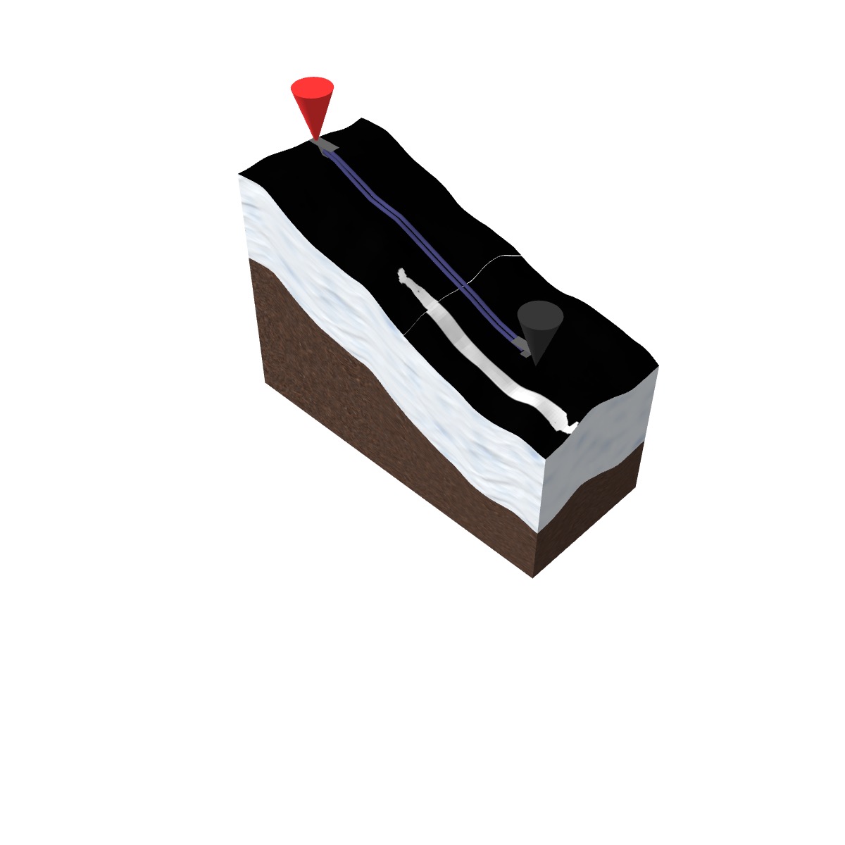
Secondly, I haven’t wrapped my head around UV Mapping textures. UV Mapping is mapping a 2D image on to a 3D surface. Even when I’m mapping it on to a plane, I initially couldn’t quite make it work like I had in my mind. As seen below, the surface I have is not a full 512x512 square, it’s clipped to only draw out a defined area. Thus, the texture mapping needs to be modified so it doesn’t map the 512x512 texture to a now smaller size, thus making it wrong. When it is wrong, the below white area is where the lift line should be, but it’s squeezed because the entire texture is being used even though the area is only a proportion.

I chose the most simple mountain to debug the maths to get the UV mapping right using the Texture transforms, but couldn’t get the texture to map properly until I hooked up a tweaker to the texture mapping and realized the Y axis was flipped!

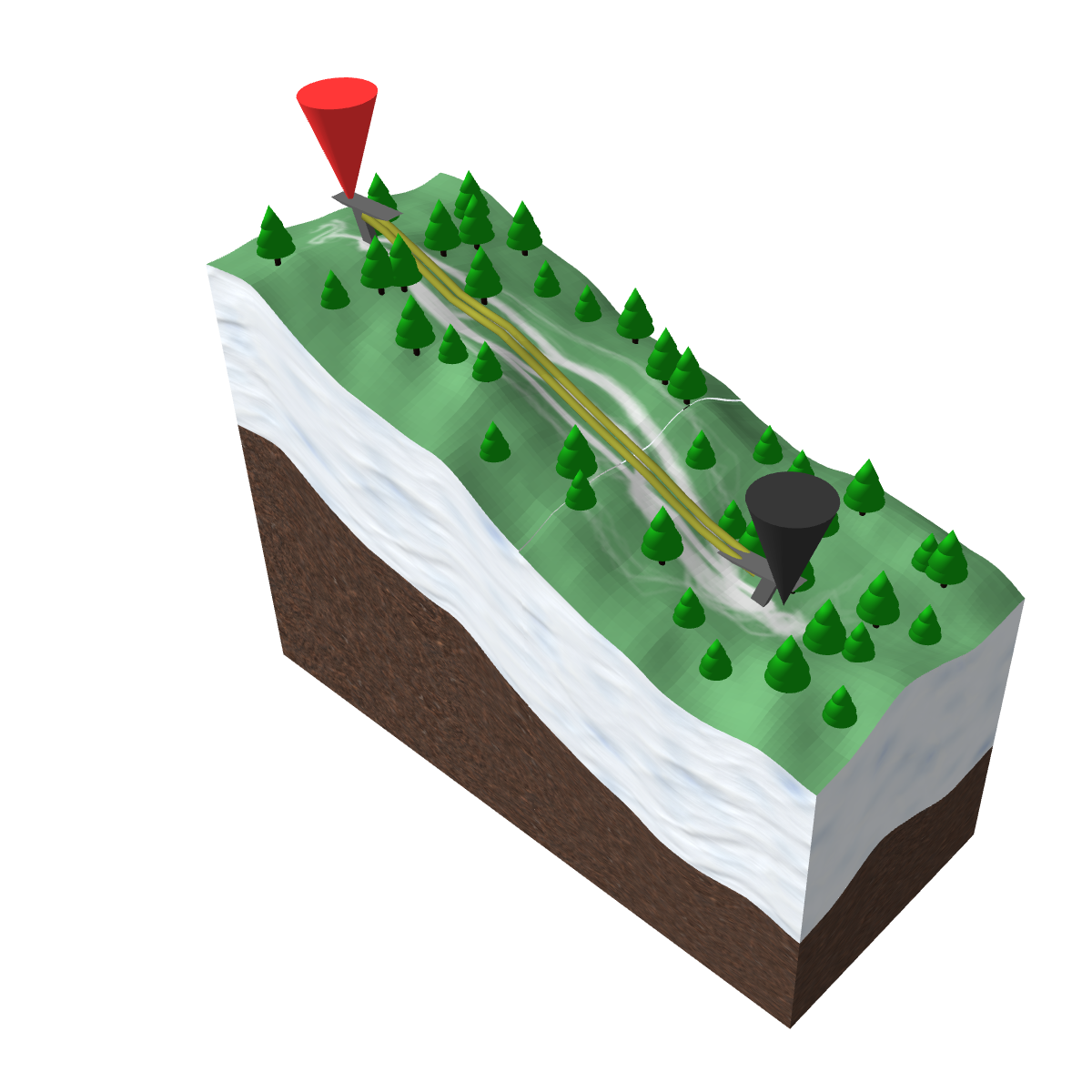
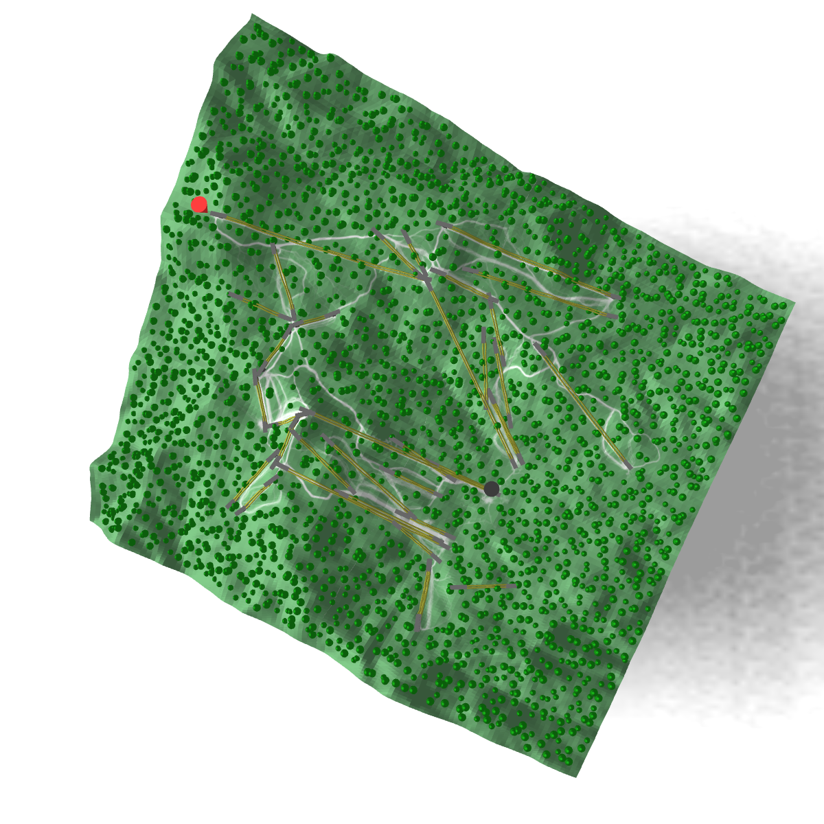
Lastly, on the tree placement, the ski runs are actually quite narrow in reality compared to what you see in resort ski maps. They’re probably exaggerated for visibility, so when you take the real proportional dimensions it doesn’t look that clear there is a ski-run. I modified the texture to have a light green shading for the off-piste areas so the white ski runs are easier to see I reckon that I need to increase the density of the trees and give the ski runs a bit more artificial width. I have some ideas on how to maybe do this when generating the textures — possibly jittering the ski run position a tiny bit when I put the texture map together.

The result is pretty nice though, but the green makes it feel like summer rather than winter.
A few things I want to improve on now. Up till now, I’ve been using flat shading for the mountain. I really like the effect of flat shading because it exaggerates the lighting to give you a much more clearer picture of the angle of the slope compared to smooth shading. The reason also is that I haven’t figure out how to correctly generate my normal (vector) maps yet.
Now that I have this, I need to go back to generate more data for more mountains. The goal is to put all of Japan’s ski resorts into a single render. I’m slowly getting there.